GotMex?
$623,493,674,868,715.98 in Debt
+193|7187

Update: Added new stuff, need help again. Please check out the last post for details.

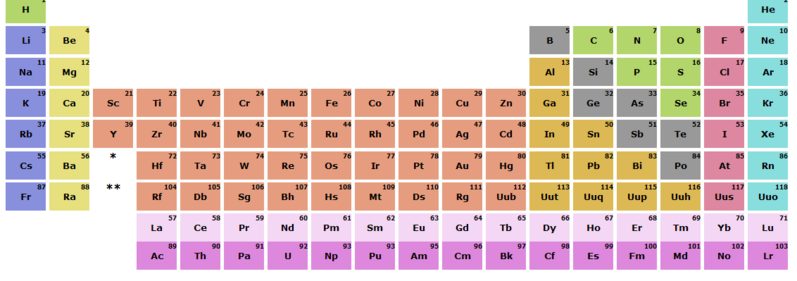
I could really use the input of any CSS guru's here. I'm making an online periodic table for one of my computer courses and I am stuck at a stupid design problem. I have my page temorarily hosted here: http://gotmex.net/p-table/.

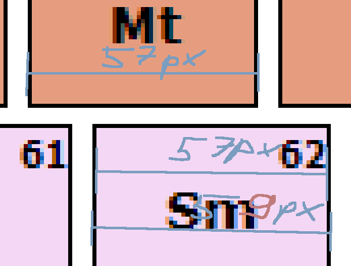
I am trying to use CSS, rather than tables, because I think I can do some cool stuff later on by just modifying the stylesheet. As you can see, the main table's cells align perfectly and there's no problem there. However, once you move down to the Lanthanide and Actinide families (the bottom rows), you can see that there are some issues with spacing, sizing, and aligning. The idea is that those cells should align with the top ones evenly.

I am at a loss of how to fix this. If you check out my code and my css, you can see that I've used the same sizing information for both parts, yet somehow the bottom rows get screwed up. I am using %'s because I want the table to scale to any resolution, rather than have it a fixed size, so changing this is not an option.

If anyone can check it out and give me some tips I'd be very grateful and I'll send some Karma your way. Thanks.

Last edited by GotMex? (2006-11-03 00:02:12)

Pvt.Kosak
Member
+125|7011
Well....It Has No Background Mate.It Looks Quite Boring No Offense .
GotMex?
$623,493,674,868,715.98 in Debt
+193|7187

(SGS)Pvt.Kosak wrote:

Well....It Has No Background Mate.It Looks Quite Boring No Offense .
Yes, thank you for pointing out that it's simple and boring lol. You got my hopes up that someone had a solution so quickly haha.

I am nowhere near done but I need to get past this problem before I continue with styling the site. I'll just keep working on adding the data, and setting up the backend database.

Last edited by GotMex? (2006-09-21 09:01:47)

Use0fWeapons
Get repairs here
+60|6958|Doncaster - UK

(SGS)Pvt.Kosak wrote:

Well....It Has No Background Mate.It Looks Quite Boring No Offense .
did you only read the first and last lines of his post or something???


Anyhow, sorry to get your hopes up again, as i clearly cant help ether.

But it looks like some kind of 'centering' problem that i get sometimes on web pages, it usually ends up with me finding some spaces or something where it shouldn't be. or that a table has a section set to automatically resize itself.

How have you done the spaces?  perhaps use some empty squares or clear spacing pics to force it all to be the same size from left to right.
But i don't know the code your using, so if this doesn't even sound remotely like something you could do, well sorry.

Good luck
lord_tyler_486
Member
+54|7177|Upper Franconia
K, I think I know whats the problem, but I have no really good idea how you might be able to solve this without using an absolute width for the divs.

The border you defined for the ACs/LAs is added to the total width of the div itself! See picture below.
https://i70.photobucket.com/albums/i95/lt486/problem.png

How I found this out? I edited the site and added a border to every div in there that I could see how the page is built. Then I removed ALL borders [ try replacing all »<div« with »<div style="border: 0px solid #f0f"« and you will see....] and finally, it was perfectly aligned. You use div containers as columns for the main part, but for the Actinide and Lanthanid families you use a row. I would advise you to use the same colums down there too [not even new ones, just place the elements into the same container div as the ones displayed above. you can use a margin-top to create a space.]. OR you could just use rows everywhere, which might be even easier. OH and BTW: the CSS-IDs should be unique in the html-code. If you use the same ID twice in one page, you should use classes.

EDIT:
Here is the result without borders:
http://i70.photobucket.com/albums/i95/l … border.png

Last edited by lord_tyler_486 (2006-09-21 09:48:30)

GotMex?
$623,493,674,868,715.98 in Debt
+193|7187

lord_tyler_486 wrote:

K, I think I know whats the problem, but I have no really good idea how you might be able to solve this without using an absolute width for the divs.

The border you defined for the ACs/LAs is added to the total width of the div itself! See picture below.
http://i70.photobucket.com/albums/i95/lt486/problem.png

How I found this out? I edited the site and added a border to every div in there that I could see how the page is built. Then I removed ALL borders [ try replacing all »<div« with »<div style="border: 0px solid #f0f"« and you will see....] and finally, it was perfectly aligned. You use div containers as columns for the main part, but for the Actinide and Lanthanid families you use a row. I would advise you to use the same colums down there too [not even new ones, just place the elements into the same container div as the ones displayed above. you can use a margin-top to create a space.]. OR you could just use rows everywhere, which might be even easier. OH and BTW: the CSS-IDs should be unique in the html-code. If you use the same ID twice in one page, you should use classes.

EDIT:
Here is the result without borders:
http://i70.photobucket.com/albums/i95/l … border.png
Sweeet, ok so I know what the problem is now. I figured it had something to do with where those percentages were being derived from, but never thought about the borders themselves. So this means that I probably won't be able to find other percentages that will keep things aligned at all sizes, damn. And yea, I used the container Id a few times to see if making each into their own little box would fix it. That's just going to go back to being one major div.

Problem is, I want to have each chemical group to be in it's own div. This way, I can display them all as rows for example with a simple stylesheet change. At first I was gonna add the AC/LC's into the colums they align with, but this wouldn't be chemically correct, and would not let me do things like this. Otherwise, a table would've sufficed and would've been infinitelly easier.

So now, on to find how to add borders to all elements... hmm.
GotMex?
$623,493,674,868,715.98 in Debt
+193|7187

Alrighty, I've advanced my web page but need some help again so I'm bringing the thread back up. I need some input on how to make this look better because although I like how it looks, the whole layout feels "cluttered". I am considering making the bottom menu/choices drop downs from the top-right corner with some nifty javascript, but maybe someone's got an idea of how to keep it all on screen. Maybe making the bottom menus smaller would make the table stand out better? But then legibility might become an issue. So please check the page out and gimme some feedback.

Additionally, I tested on IE 6 and Firefox 2.0, and so far the only browser it looks ok on is FFox. IE mangles my layout like none other and sadly I don't have enough time to fix that right now. Also only the highlight menu is coded so far, and it is only working for Firefox (of course) so that's another issue as well... I'm just saying I am aware of this stuff. Thanks.

Ignore the old link btw, it is now @ http://gotmex.net/p-table/

Board footer

Privacy Policy - © 2025 Jeff Minard