10/10
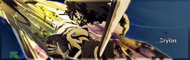
6/10 : concept 10/10, final result 2/10.
What color would look good then?Z-trooper wrote:
however I still dont like the creamy colors sry..
for that sig... - I dont know, its a hard one because of the array of background colors. but there are two things that I dont like about the creamy color:Ryan wrote:
What color would look good then?Z-trooper wrote:
however I still dont like the creamy colors sry..
- I just dont like creamy colors at all - dunno why
- its sort of close to the ninjas shirt which makes it kind of hard to see him I think..
suggestion:
darker color, maybe black with some blue in it.. but thats only how it looks in my head, dont know how it would look for real..
EDIT:
sort of like that (very crude but it shows what I mean)..
the blue is the negative of that creamy thing before, which provides better contrast imo..
EDIT#2:
Updated mine.. I'm running out of ideas..
too much text?
Last edited by Z-trooper (2007-06-20 17:10:24)
Yea, take off the "darkness fall"...
haha alright, but that will have to wait till tomorrow.. I'll hit the sack now..rabee2789b wrote:
Yea, take off the "darkness fall"...
Well I'll mess around with some of the colors tomorrow. I'll see what turns up and I'll be sure to let you know. Thanks.Z-trooper wrote:
for that sig... - I dont know, its a hard one because of the array of background colors. but there are two things that I dont like about the creamy color:Ryan wrote:
What color would look good then?Z-trooper wrote:
however I still dont like the creamy colors sry..
- I just dont like creamy colors at all - dunno why
- its sort of close to the ninjas shirt which makes it kind of hard to see him I think..
suggestion:
darker color, maybe black with some blue in it.. but thats only how it looks in my head, dont know how it would look for real..
EDIT:
http://i192.photobucket.com/albums/z232 … -4copy.png
sort of like that (very crude but it shows what I mean)..
the blue is the negative of that creamy thing before, which provides better contrast imo..
EDIT#2:
Updated mine.. I'm running out of ideas..
too much text?
maybe just more greenish, I like the tones there, rather than blue or red for it...
which one by the way, the one here:
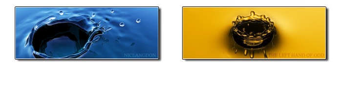
or the one in my sig
which one by the way, the one here:
or the one in my sig
Last edited by Nicholas Langdon (2007-06-20 20:06:54)
I actually like all three
You could change the drop shadow distance to 0 to give it a better look IMO.
It's going to be hard to change the background color of my sig because I have serveral layers that have the applied image on them, so I would have to hide all those, change the background color, and then I'd have to remove the warming filters and make them cooling filters (if I were to change the background to blue)
So I think I'll keep it as is.
Last edited by Ryan (2007-06-20 20:23:06)
nick, your are really appealing to me i love a good stock that draws the eyes attention, that your does. I like on the leaf one you Gaussian blurred the tag then erased the focal good style. both 8/10 IMHO !
just made this for a request, idk it's not really my Style but i gave it a shot he wanted a robot from transformers movie.

Last edited by kikkin_assssssssss (2007-06-21 00:00:52)
^ Not really my style of sigs but they are pretty cool
Wahoooo RDMC(2) my friend. I like that sig and I can't wait till this game comes out. You get 8/10.
Although you need to add some colors
Although you need to add some colors
Last edited by rabee2789b (2007-06-21 01:44:28)
good 8/10.rabee2789b wrote:
Wahoooo RDMC(2) my friend. I like that sig and I can't wait till this game comes out. You get 8/10.
Although you need to add some colors

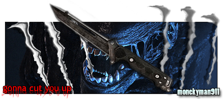
lots of colors, some good knife kills. its different. but what I like the best is that its 2 pics with links.. so 8/10
Rated before! Not gonna take off the text?
Last edited by rabee2789b (2007-06-21 05:16:35)
i like it execpt for the top and bottom border 9/10
yea yea patience my friend have been at the university all day, but I'm home now so I'll get on it..rabee2789b wrote:
Rated before! Not gonna take off the text?

this better? -_-
Nice idea, but remove the inner shadow or gradient or whatever is is in "darkness falls" and put it to overlay or something.
@ the one in your sig. The new one is not good.
7/10
@ the one in your sig. The new one is not good.
7/10
Last edited by Jenspm (2007-06-21 06:22:38)

I think it's too small, and what's the thing in the background? I like the shadow around it though, 7/10.
Anyone wanna tell me how to place my sig in the middle? I think there is a command you type in "personalty" in your profile.
Cheers
Anyone wanna tell me how to place my sig in the middle? I think there is a command you type in "personalty" in your profile.
Cheers
Last edited by rabee2789b (2007-06-21 06:55:04)
as far as I know you can do two things:rabee2789b wrote:
I think it's too small, and what's the thing in the background? I like the shadow around it though, 7/10.
Anyone wanna tell me how to place my sig in the middle? I think there is a command you type in "personalty" in your profile.
Cheers
either make some spaces untill it fits or you expand your canvas and make it transparant:

but both methods are a matter of trial and error
EDIT:
just made a sig for monkeyman911
rate, comment/suggestions..
Last edited by Z-trooper (2007-06-21 07:07:23)
Uh don't like it 6/10 you've done better ..
@ your own sig 7/10 ..
@ your own sig 7/10 ..
6/10
2/10 stat sigs suck